
pegore
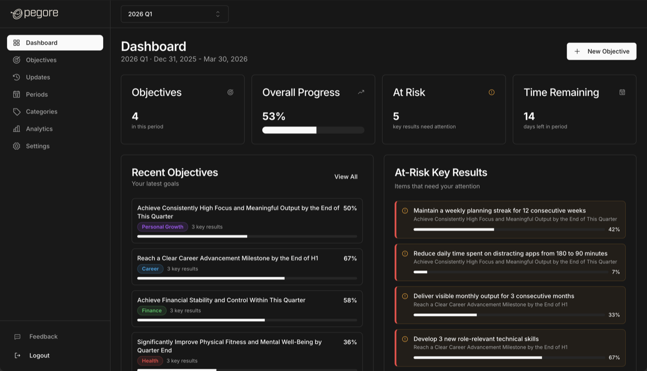
pegore is a personal OKR tracker for people who have outgrown habit apps. You set objectives, define key results you can actually measure, log progress against them, and open the dashboard on a Monday knowing where you stand in about ten seconds. It is at pegore.com (opens in a new tab).
What it is arguing against
Most personal goal software is a habit tracker wearing a suit. It counts consecutive days, it awards you a badge, and when you miss one it shows you the broken chain. That mechanic works on brushing your teeth. It does not work on a key result that only moves twice a month, and it quietly converts a planning tool into a source of guilt.
So the product document names what pegore is not, and the list is short and specific. Not Todoist or TickTick: no streaks, no coloured priority badges, no task-list density. Not enterprise OKR software: no heavy tables, no modal-first flows, no performance-review vocabulary. Not a generic SaaS landing page: no gradient, no floating shapes, no all-in-one promise. The homepage line — no streak pressure — is a summary of that list, not a slogan written after the fact.
Colour reports state, never importance
The palette is split in two, and the split is enforced. Everything structural is neutral. Beside those neutrals sit exactly four hues, and the design file labels them as status signals for semantic use only: green for on track, amber for at risk, red for a fault, blue for a reference. None of the four is available to make something look important.
Importance is carried by scale and contrast instead. A number that matters gets room and weight, not a colour — which is the only reason the four signals still read as signals when they do appear. A palette that spends green on emphasis has nothing left to say when something is genuinely on track.
There is one more source of hue, and it is worth being exact about because a screenshot gives it away: a category badge is drawn in a colour, and that colour is not the design system's. You pick it when you make the category. The system has no opinion about which of your categories matters, so it does not assign them colours — it renders the label you chose in the colour you chose, and keeps its own four for saying what is on track and what is not.
This is the same conclusion Lite Journal reached from the opposite end, and neither borrowed it from the other: hue reports state, hierarchy is text. Two tools, two problems, one constraint arrived at twice.
The subtraction
Objectives used to carry a status label of their own. It was removed, and what is interesting is why: the label was a second opinion about something the key results underneath had already answered. If three of four key results are complete, the objective's progress is not a matter of interpretation, and asking the user to also maintain a status was asking them to restate their own data by hand.
An objective now shows progress toward its key results and nothing else. One fewer field to fill in, one fewer thing that can disagree with the numbers below it.
The reversal
There was a waitlist. Signing up meant asking, and then waiting for an invite. It is a normal growth tactic and it was dropped: anyone can now sign up directly, with no invite and no queue. Worth stating plainly rather than quietly deleting from the history, because the scarcity was manufactured and the product was not better for it.
The failures worth fixing first
The premise of the app is the period — a quarter, a month, whatever unit you actually plan in. Which makes it worse than embarrassing that for a while the app held two different opinions about which period it was.
- One part of the app worked out the active period from its date range. Another read a manual flag. When those disagreed, the dashboard and the periods page told you different things about the same Monday. Both now derive it from the date range; there is one answer.
- Choosing a past or future period did not survive a reload. You would go back to last quarter, refresh for any reason, and be silently returned to today's without being told. The selection is now stored and restored.
- Logging progress for a past date produced wrong history. The entry saved, but the before-and-after values it recorded were computed as though you had logged it today, so the trail you would later rely on was quietly false.
- Pressing Back on a finished onboarding step could lock you out of onboarding entirely — a dead end on the one flow a new account cannot skip.
- Account deletion took two passes to get right, and then a third change to make it GDPR-complete. It is listed here rather than rounded up, because a delete button that half works is worse than one that is honestly missing.
None of these were visible defects. Nothing looked broken; the app just occasionally told you something untrue about your own goals, which is the only kind of bug that matters in a tool you are supposed to plan against.
Where it is now
Forty-eight releases, counting the first in January 2026, and still deliberately small: no team features, no integrations, no AI assistant offering to write your objectives for you. If you want to use it rather than read about it, it is at pegore.com (opens in a new tab).